
Topping Out [Part III]
As a wrap-up of our festivities at the CMC/CUT, this final post of the three-part article presents a couple of broad observations from the overarching vantage that we were given...

Union Terminal main lobby (3/31/8).
OBSERVATION I: Directional Elements
The building itself seems to be a guide for it's inhabitants.
There are signs everywhere. I'm not talking about written, overt signage here, but the underlying directional elements embedded within the design of the structure; shapes and patterns relaying not only the Art Deco aesthetic element of 'echoing' (repetitive Southwestern motifs) but a secondary, utilitarian influence - an abstractly geometric and artistic representation of the mechanized, Industrial Era.

It's obvious that the designers sought to use materials and develop spaces that would last indefinitely (unlike the current trend of build-and-renovate, or build-and-rebuild) - apparent not only through the quality of construction or use of expensive materials, but the implicit design within all dimensional spaces - through the use of designed traffic patterns, or inlaid mapping.
An ordered balance was given special attention to the construction and design of the Terminal - geometric patterns, echoed shapes, and broad, flat hues. A closer look at any detail, any inlay, any mosaic, will reveal a narrative of transportation, and not just with the overt vehicles of transportation (car, boat, train, and plane). Within this narrative, within the walls, floors, and ceilings, lay guides for behavioral direction.
For example, take the overall shape of the building - a round main body with arms open, extending out from either side, welcoming and inviting visitors. Roads aiming toward the right arm led vehicles through portals, to the interior of the building, and out the left arm - a kind of half-moon flow that needs little signage for comprehension (aside from specific train info for travelers).

Additionally, on the interior of the pedestrian concourses, the broad silhouette of the curved structure is conducive to guiding people in the right direction, again, without much written signage needed - enter in the main doors, hit any of the walls of the main lobby (to purchase a ticket), then maintaining that directional force, follow the walls to the central corridor to the trains. Easy.
Okay, so that's a little obvious. Well, if you peer further, the floors in most rooms of the building have patterns that, if followed, will lead to specific utilitarian areas. For example, in the current Amtrak waiting room [see photo in Part II], broad inlaid stripes wind around and lead to the individual phone stalls, the bathrooms, and the entrance/exit (also, one leads directly into a wall, which used to be the bathroom/showering area - how would I have known to inquire about this without the mapping within the floors?).
None this may not be a surprise to you, or even that interesting, especially those with an architectural or design background - as Louis notably stated "form ever follows function".
And speaking of Sullivan, even though he wasn't the architect, his influences spread heavily throughout era. This building was much more organic than Sullivan's early-20th cubes, with the interior completely representative of his student's aesthetic, but the "signature element of Sullivan's work is the massive, semi-circular arch" which is obvious at the CUT.

Source: Wikipedia.
Anyway, in today's age of massive signage, electronic overlays, and overly-overt descriptions and rules (the dumbing down of the masses), a smartly designed structure, from its inception to conclusion, is 180˚ from our 'contemporary' culture (i.e. Eisenman's Deconstructivist design for UC's Aronoff inherently confuses its inhabitants).
As much as I like and admire philosophical advancements which break from conventions in the world of architecture, urban planning, and design (especially Deconstruction, which I've studied broadly), the Cincinnati Union Terminal can still teach us a lesson or two about balancing the principles of functionality, sustainability, and presence, in this current era of unending, yet often misguided and unplanned growth.
OBSERVATION II: Futurism
The structure holds one of my favorite traits: optimistic futurism.
Not only in the project's scope, or its architectural grandeur, or even the unusual interior qualities afforded by it's makers (such as leather interior settees placed in groups - rather than the normal rows of wooden benches seen in other stations), but as a larger concept driving the ambition of people to create practicality, sustainability, and perfection.

Source: CincinnatiViews
Upon taking pictures of the murals in the rotunda, I noticed the futuristic city scenes depicted in the tiles, which sparked my interest not only in the artwork, but in the original concept and purpose of the structure as a whole. This was a lavish building constructed as a 'front door' to the city for visitors (coming by rail, obviously) - a magnificent, opulent, modern ideal of transportation infrastructure, and a representation of Cincinnati's optimistic, hospitable, and modern attitude.
For example, within the left-hand mural at the end of the narrative, a futuristic cityscape is represented in typical early-20th century, Art Deco fashion - a series of broad, linear shaped depicting a bustling, condensed, extremely tall metropolis with multiple modes of transportation. In other words, an optimistic, idyllic setting generated by the growth of humankind.

Detail of left (south) mural, Union Terminal main lobby, by Winold Reiss.Made in 1932, this side of the rotunda depicts 'the development of the nation', while the other side (not shown) depicts 'the growth of Cincinnati', with a cityscape at the end of the narrative similar to the one shown above.
Source: City of Cincinnati.
Source: City of Cincinnati.
With the section above in particular, what interested me was Reiss' depiction of the modern city in relation to other Futurist art of the time - especially the repeated elements of aqueduct-style rail supports stories aboveground. These motifs are seen repetitively throughout pop culture of the time, but why? Are these paths built so high because they thought it would take people forever to travel up and down the individual mega-structures (to catch trains on the ground floor)? Are they a modern bow the Roman aqueducts that were so modern for that time? Or maybe futuristic 'skywalks' that so eloquently discourage pedestrian street-level traffic and kill the spirit of city life, such as in Cincinnati?

Source: Steven Brook and this book.
Well, most likely they are just metaphors the general progress of humankind, commonly felt in the Industrial Age of mechanization (with 'height' being a symbol of this modernization). But whatever the real intent, it's obvious that the future city is almost always foreseen as an ultra-congested, multi-dimensional, and ultra-modal space, which speaks to the main reason for construction of the Terminal - consolidation and convenience. The few examples below parallel Reiss' view of the future city, with transportation being a central element throughout...


Futuristic urban landscapes depicting transportation on multiple levels.Reminiscent of Fort Washington Way.

More cities of the future with multiple modes of congestion.Another parallel to Reiss' concept in the middle.
Source: Forrest Ackerman.
Source: Forrest Ackerman.
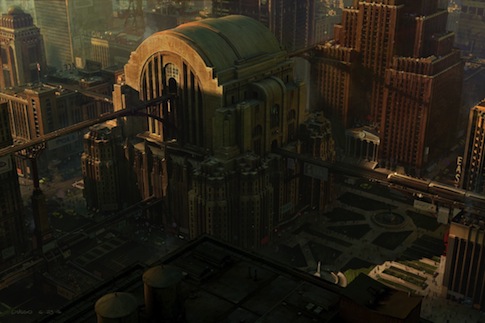
Concept art for the video game, Superman Returns.A Union Terminal replica (similar to that discussed in the previous post, Super Station).
And what does this have to do with the CUT specifically? Well, I think the ideas in the murals (and other concept art of the time) represent what the builders planned for the future of Cincinnati: a city dedicated to displaying itself positively and prominently to the world, a master of innovation and progress, and a symbol for the future metropolis that would arise from its core, holding vast structures and various, simultaneous transit options for its citizens.
Only recently have we seen the spade hit the soil for some of these qualities to be unearthed. Hopefully, once again, Cincinnati can become the metaphorical 'Queen City of the West' - a city to be emulated for its current assets, as well as its promise of tomorrow.
• Read more about the Union Terminal mosaics at the CMC website here, and research the general history of the building here. Further reference of 1930s-modern style architecture can be found here.
![]()


2 comments:
Wow, a great and thorough post!
Yeah, great breakdown. I especially liked your breakdown of architectural elements and wayfinding.
I believe you're right - you just couldn't get away with that today. Everything has to be so obvious.
Post a Comment