Topping Out [Part II]
As a continuation of the visual research at the CUT, we jumped onto a free tour of the rotunda, which was offered immediately following the conclusion of the "High Steel Tour". Basically, this was a guide focused on the architecture and interior design of the place - a nice compliment to the constructive aspects in the preceding discussion.
Rotunda Tour
We visited just about every space usually off limits to the public (not occupied by the museums or library) with a general description of the architecture, design, artisans, and history of each. It was all incredibly interesting, yet the most amazing part of the history included the areas where things had been removed or discarded over the years (Serpentine counter seating at the Gateway Cafe, defaced wall paintings, demolished concourse with mosaic US map, etc.)... really shocking.
After taking about 20 shots along the way, I realized that almost every picture of the building could be a postcard - there's just way to much to capture within a single frame (let alone, a single memory card). The building was uniquely and beautifully designed... down to every last moulding, doorknob, and vent cover.
The following photos show just a few of the stops we made:


 2nd-floor walkway, above main entrance to the Terminal [3/30/8].
This was a simple beginning to the tour, where our guide discussed the interior designs that we all know and love, but I wasn't even aware that this walkway existed, which itself was pretty interesting. Note: There's actually several feet of dead space between the exterior facade and the interior windows (where the clock innards are maintained).

 Secretary's Office, east wing [3/30/8].
Literally everything was created specifically for the structure. Interesting things of note here: unique lamps, floors (and some walls) made of cork, and a cabinet which once held all the keys for every part of the building.
 President's Office, east wing [3/30/8].
Amazing, amazing round space. This sat right next to the Secretary's Office, obviously.
 Fireplaces in the President's Office / Conference Room, east wing [3/30/8].
Again, it seems that no expense was too great (especially during the Depression, where all materials and labor were offered at bare minimum) - inlay wood patterns, unique metal lighting, ornamental fire screens, smoothed limestone, and again, cork flooring (wouldn't this have been a fire hazard?). These two rooms were interconnected.

 Conference Room, east wing [3/30/8].
Again, great details - note the built-in ashtrays in the sofa arms.

 Amtrak Waiting Room, north end [3/30/8].
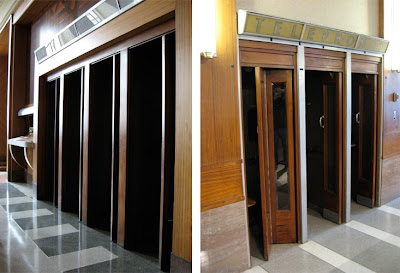
This room, open only during the three times a year that Amtrak delivers a train from Chicago, actually used to be the "Men's Lounge", featuring intricate wall designs, bathroom/showers, and phone booths (seen in the phone photo, above left). There was a complimentary "Women's Lounge" in the west wing of the building (near the restaurant areas), but ran out of juice in my camera - was the same, if not more, intricately designed (i.e. Pierre Bourdelle's carved/painted linoleum panels).
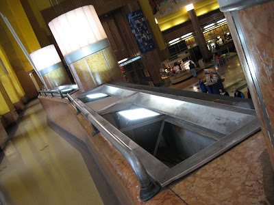
 Drinking fountain, west wing [3/30/8].
After two decent-sized tours throughout the building, we were parched.
 Doors, CMC/UT [3/30/8].
Exiting our tour, and the building.
• Visit the Cincinnati Museum Center at the Union Terminal for more information on these tours and other 75th Anniversary events - they're worth every minute and dollar. Also, visit the Center's corresponding Anniversary website here.


4 comments:
Great series so far!
I like that big marble drinking fountain. As I recall the urinals are of the same marble and in the same style.
Did you walk on the glass walkways between the front windows?
Great post.
Glass walkways? No. I'll have to hit the docents up again for an inside track when I have more time next visit...
Thanks.
Very nice! I've been wanting to see those back room offices for so long. I've never visited those areas in person. Thats a goal for this summer:)
Post a Comment