Tuesday, April 29, 2008

Auf Wiedersehen

After very little deliberation, I've decided to halt this site indefinitely.

I've enjoyed posting here about my thoughts and reflections of Cincinnati, as well as being part of the local blogging community, but my time has become increasingly limited for activities such as this.

Several posts ago I listed a multitude of topics that I planned to explore, and had grand ideas of fulfilling them all within a short time frame (to the extent that they deserve), but the progression on these topics slowed with their respective problems. Currently, I have about 6 different articles started, but with them all, I've encountered rough spots that require travel, external research, scanning, editing... lots of time.

Overall, the necessities to complete well thought out, informative, and engaging articles, are unnecessary (and possibly detrimental) to the growth of my familial and professional life. I obviously have never had the intention of living-and-dying with this blog, and right now, every minute counts.

I'll leave this site up for awhile with the hope that I might be able to return to it, but for now, consider it vacant. That being said, if anyone should care to comment on past articles, or send me a personal email, I'll surely respond.
Additionally, I'll still be occasionally perusing through (and possibly commenting on) your sites as well.

I appreciate those who have added me to their blogroll, and those who have commented on posts, but don't consider this a total loss unless you come back one day and see that the site no longer exists.

To everyone who contributes to the positivity and progress of Cincinnati:
Keep up the good work!


Wednesday, April 23, 2008

Neighbor: Visualingual

I usually don't do this, mainly because there are so many great Cincinnati blogs out there already (that I read daily) and focusing attention on just one seems unfair... but... this one has just the right mix of inspirational assets for me to keep reading, keep flipping through the archives, keep wanting more...
it's Maya Drozdz's Visualingual.


Perspectives of Cincinnati public art, from the blog Visualingual.
Ghettopia, Floral Carpet, and the Stanczak Installation.


I'm not sure why I haven't run across it before, since I've had Michael Stout's justforview on my blogroll for some time now - little did I know that he was in cahoots with Maya, forming an interesting all-media design studio, VisuaLingual. As with Mike's, it seems that Maya's blog is a satellite (personal extension) of the interesting material that's being produced at their work site (indicated by the case-changes of the L).


While I have a lot of interests, my ears always perk up when hearing about anything related to construction, architecture, transportation, history, or infographics, and when these issues cross hairs with aspects of Cincinnati, the respective site is almost always guaranteed of increasing its readership. So, as noted in her 'About' section, it's no surprise that I found Maya's site attractive:
My interests include urban life, visual culture, typography, cartography, architecture, interior design, and home decor, and this blog focuses primarily on points of intersection among those areas.


Interesting world art, from the blog Visualingual.Milk Bottles, With Fences, City Plates, and the Cincinnati Gardens.


As much as I love the blogs dedicated to the area's social perspectives, construction efforts, political sparklines, daily events, and personal meanderings, sometimes just trolling down creative avenues is a nice change of pace - especially with the interesting, abstract viewpoints that Maya affords.


Views of OTR Cincinnati, from the blog Visualingual.
Ghost sign, 20-cent payphone, Smitty's, and Twilight.


I'm missing a lot of interesting visuals in this post (such as her textile finds, other artwork, and repetitive postcard-like photos, etc.), so check out Maya's site on your own for more info. Expand your periphery, and support local business - frequent Visualingual and VisuaLingual.


• I think Mike's blog, justforview, requires secondary props here, due to the fact that he's also what makes the studio VisuaLingual tick. He's also switched to a different template, making it much easier on the eyes to read. Check it out.

Monday, April 21, 2008

Topping Out [Part III]

As a wrap-up of our festivities at the CMC/CUT, this final post of the three-part article presents a couple of broad observations from the overarching vantage that we were given...

Union Terminal main lobby (3/31/8).


OBSERVATION I: Directional Elements


The building itself seems to be a guide for it's inhabitants.
There are signs everywhere. I'm not talking about written, overt signage here, but the underlying directional elements embedded within the design of the structure; shapes and patterns relaying not only the
Art Deco aesthetic element of 'echoing' (repetitive Southwestern motifs) but a secondary, utilitarian influence - an abstractly geometric and artistic representation of the mechanized, Industrial Era.


'Echoed' geometric patterns and directional elements.


It's obvious that the designers sought to use materials and develop spaces that would last indefinitely (unlike the current trend of build-and-renovate, or build-and-rebuild) - apparent not only through the quality of construction or use of expensive materials, but the implicit design within all dimensional spaces - through the use of designed traffic patterns, or inlaid mapping.

An ordered balance was given special attention to the construction and design of the Terminal - geometric patterns, echoed shapes, and broad, flat hues. A closer look at any detail, any inlay, any mosaic, will reveal a narrative of transportation, and not just with the overt vehicles of transportation (car, boat, train, and plane). Within this narrative, within the walls, floors, and ceilings, lay guides for behavioral direction.

For example, take the overall shape of the building - a round main body with arms open, extending out from either side, welcoming and inviting visitors. Roads aiming toward the right arm led vehicles through portals, to the interior of the building, and out the left arm - a kind of half-moon flow that needs little signage for comprehension (aside from specific train info for travelers).


The Cincinnati Union Terminal facade.A welcoming presence - similar to a 'husband' pillow?


Additionally, on the interior of the pedestrian concourses, the broad silhouette of the curved structure is conducive to guiding people in the right direction, again, without much written signage needed - enter in the main doors, hit any of the walls of the main lobby (to purchase a ticket), then maintaining that directional force, follow the walls to the central corridor to the trains. Easy.

Okay, so that's a little obvious. Well, if you peer further, the floors in most rooms of the building have patterns that, if followed, will lead to specific
utilitarian areas. For example, in the current Amtrak waiting room [see photo in Part II], broad inlaid stripes wind around and lead to the individual phone stalls, the bathrooms, and the entrance/exit (also, one leads directly into a wall, which used to be the bathroom/showering area - how would I have known to inquire about this without the mapping within the floors?).

None this may not be a surprise to you, or even that interesting, especially those with an architectural or design background - as Louis notably stated "form ever follows function".

And speaking of Sullivan, even though he wasn't the architect, his influences spread heavily throughout era. This building was much more
organic than Sullivan's early-20th cubes, with the interior completely representative of his student's aesthetic, but the "signature element of Sullivan's work is the massive, semi-circular arch" which is obvious at the CUT.


National Farmer's Bank, Owatanna, MN (1908) by Louis Sullivan.A sister Cincinnati Union Terminal facade.
Source: Wikipedia.

Anyway, in today's age of massive signage, electronic overlays, and overly-overt descriptions and rules (the dumbing down of the masses), a smartly designed structure, from its inception to conclusion, is 180˚ from our 'contemporary' culture (i.e. Eisenman's Deconstructivist design for UC's Aronoff inherently confuses its inhabitants).

As much as I like and admire philosophical advancements which break from conventions in the world of architecture, urban planning, and design (especially Deconstruction, which I've studied broadly), the Cincinnati Union Terminal can still teach us a lesson or two about balancing the principles of
functionality, sustainability, and presence, in this current era of unending, yet often misguided and unplanned growth.

OBSERVATION II: Futurism

The structure holds one of my favorite traits: optimistic futurism.
Not only in the project's scope, or its architectural grandeur, or even the unusual interior qualities afforded by it's makers (such as leather interior
settees placed in groups - rather than the normal rows of wooden benches seen in other stations), but as a larger concept driving the ambition of people to create practicality, sustainability, and perfection.


Original Train Concourse and Passenger Waiting Area, interior CUT.This postcard shows the bubble seating and subtle wayfinding elements on the floor.
Source: CincinnatiViews


Upon taking pictures of the murals in the rotunda, I noticed the futuristic city scenes depicted in the tiles, which sparked my interest not only in the artwork, but in the original concept and purpose of the structure as a whole. This was a lavish building constructed as a 'front door' to the city for visitors (coming by rail, obviously) - a magnificent, opulent, modern ideal of transportation infrastructure, and a representation of Cincinnati's optimistic, hospitable, and modern attitude.
For example, within the left-hand mural at the end of the narrative, a futuristic cityscape is represented in typical early-20th century, Art Deco fashion - a series of broad, linear shaped depicting a bustling, condensed, extremely tall metropolis with multiple modes of transportation. In other words, an optimistic, idyllic setting generated by the growth of humankind.


Detail of left (south) mural, Union Terminal main lobby, by Winold Reiss.Made in 1932, this side of the rotunda depicts 'the development of the nation', while the other side (not shown) depicts 'the growth of Cincinnati', with a cityscape at the end of the narrative similar to the one shown above.
Source: City of Cincinnati.


With the section above in particular, what interested me was Reiss' depiction of the modern city in relation to other Futurist art of the time - especially the repeated elements of aqueduct-style rail supports stories aboveground. These motifs are seen repetitively throughout pop culture of the time, but why? Are these paths built so high because they thought it would take people forever to travel up and down the individual mega-structures (to catch trains on the ground floor)? Are they a modern bow the Roman aqueducts that were so modern for that time? Or maybe futuristic 'skywalks' that so eloquently discourage pedestrian street-level traffic and kill the spirit of city life, such as in Cincinnati?


The Aqueducts of Claudius, Rome, and the Skywalks of Cincinnati, Ohio.Maybe referencing the past, but definitely not intending for this kind of future.
Source: Steven Brook and this book.


Well, most likely they are just metaphors the general progress of humankind, commonly felt in the Industrial Age of mechanization (with 'height' being a symbol of this modernization). But whatever the real intent, it's obvious that the future city is almost always foreseen as an ultra-congested, multi-dimensional, and ultra-modal space, which speaks to the main reason for construction of the Terminal - consolidation and convenience. The few examples below parallel Reiss' view of the future city, with transportation being a central element throughout...


Scenes from the film Metropolis (1927) by Fritz Lang.Preliminary artwork followed by two screenshots from the film.


Futuristic urban landscapes depicting transportation on multiple levels.Reminiscent of Fort Washington Way.


More cities of the future with multiple modes of congestion.Another parallel to Reiss' concept in the middle.
Source: Forrest Ackerman.


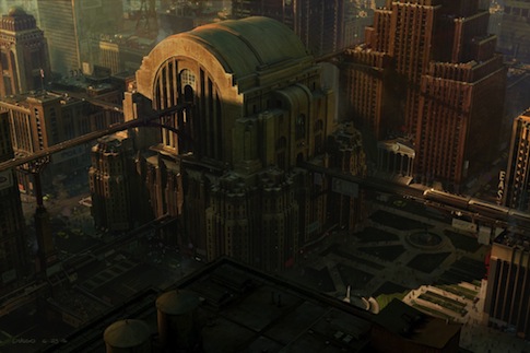
Concept art for the video game, Superman Returns.A Union Terminal replica (similar to that discussed in the previous post, Super Station).


And what does this have to do with the CUT specifically? Well, I think the ideas in the murals (and other concept art of the time) represent what the builders planned for the future of Cincinnati: a city dedicated to displaying itself positively and prominently to the world, a master of innovation and progress, and a symbol for the future metropolis that would arise from its core, holding vast structures and various, simultaneous transit options for its citizens.

Only recently have we seen the spade hit the soil for some of these qualities to be unearthed. Hopefully, once again, Cincinnati can become the metaphorical 'Queen City of the West' - a city to be emulated for its current assets, as well as its promise of tomorrow.


• Read more about the Union Terminal mosaics at the CMC website here, and research the general history of the building here. Further reference of 1930s-modern style architecture can be found here.


CPD in the National Spotlight... Again...

...though this time for their great sleuthing!

While driving back from Savannah, I was flipping through the limited stations available in the hills of Tennessee, and finally sat on NPR (at WKNO-FM 91.1) for a few minutes when I heard the news:


Click here for the full episode.

I hadn't heard about this until catching it on the radio show Wait Wait...Don't Tell Me!, but after researching the story a bit, it seems that it was the kind of weird news that almost every outlet in the nation picks up on.

And considering the negative bias that the national (and local) news has had toward the CPD (and the city in general), at least this one was semi-positive.

Peter Minges & Son Candy Store, West Court Street.
Source: Gary Landers, Cincinnati Enquirer (here).

With this newfound notoriety, maybe Minges will buck the trend of 'history' leaving for the suburbs by maintaining many more years downtown.

• Appropriate condolences here.

Friday, April 11, 2008

The Cincinnati Kid

Driving to work this morning, the news on WVXU (91.7 FM) played an interesting ad for the nationally syndicated show, This American Life - looks like Springer will be a topic of conversation (which shed him in Kennedy's light as a politician - in the ad, at least).

Jerry Springer gesticulating.Source: Michael E. Keating (via this Enquirer article).

Ira Glass hosts the new episode, "Leaving the Fold" (airing on WVXU, Sunday, April 13th), which discusses "stories of people leaving the situation they're used to - and striking off for something less familiar." The topic of Jerry comes early, in the section titled, "I've Got a Secret I've Been Hiding From You":
 

This American Life producer Alex Blumberg tells the true story of Jerry Springer's life before he was a talk show host. It's the story of an idealistic and serious Jerry Springer, a progressive politician, and the most popular mayor ever of a certain American city. (31min)

This American Life airs Sundays @ 4pm on WVXU
(I listen to it on iTunes) - one of my favorite pastimes, which got me revved up hearing about another notable Cincinnatian in the national spotlight. Also, I'm sure you're aware of the TV show, his past radio show, and the movie, but an opera?.. info here.

Maps and Manifests

Upon research of WVXU's website, I found information on an interesting-looking weekly show, Around Cincinnati, which seems to discuss art-related happenings, interviews with authors, and other events as they relate to the city's citizens and establishments. For example, in their archives you can replay a discussion of the recent Weston Art Gallery show, CANstruction (of which Queen City Survey also just posted some great pics).

But, what really caught my eye was the upcoming show with the topic of a current Cincinnati Art Museum exhibition, Maps and Manifests (the link also directs you to CAM's Youtube channel, which I didn't know existed until now - here, check out the Damascus Room vid... I used to love this room as a kid, but would have a hell of a time finding it, way in the back of the little traveled Eastern/Asian section of the museum).


"Black Venus" [2005] by Mark Bradford. 
Mixed media collage, 130 x 196 inches - gargantuan (as is most of his work).

Anyway, I'm a big fan of maps and infographics (along with
architectural renderings and references to urban construction), and their sometimes abstract depictions of the 'real world', which sparks my interest in Mark Bradford's work.

The CAM describes Bradford as an artist who "creates large-scale mixed media works that address topics such as urban sprawl, the local effects of globalization, and borders." So it's no wonder that he's showing here, since all three of these issues reflect the concerns of Cincinnati (and Ohio as a whole).

• More info on Bradford at art21 (which is a great show frequently played on PBS, by the way). Also, don't forget that the Cincinnati Art Museum is now always free (thanks to the great Cincinnati-based Rosenthals'
philanthropy), though, some exhibitions might be a couple of bucks extra - still, it's a helluva good deal. Finally, "Around Cincinnati" airs every Sunday @ 7pm on WVXU (91.7 FM) - subscribe to their Feed / Podcasts here.

Wednesday, April 9, 2008

Prepare To Believe

Earlier today, I was minding my own business (in my field - making the daily rounds through the mograph community), when lo 'n behold, I practically tripped over this reference to our great city:


TV spot for Creation Museum [2007] . 

Direction, design & animation by Todd Hemker & Soyeon Kim at Yellow Shed.

To be honest, I'm posting this because of my ambivalence toward the video's renewed prominence out there in the world. Specifically, I was surprised to see this showcased on No Fat Clips - not because it's an inferior piece (Hemker & Kim really have a nice aesthetic goin' on) but because I think the subject matter really ruled the decision for the posting.

And honestly, nothing wrong with that either... but, you know, it seems that a lot of things holding the kindling for fiery debate seem to hibernate in/near Cincinnati, and for better or worse, national attention propels this subjectivity (usually negative) in outsiders minds. [Without linking directly to the negativity] Politics, sports, crime, infrastructure, art, religion, etc., all seem to have been touched in one way or another by the hand of the region's Bible Belt conservatism.

King of Kings Statue (Solid Rock Church), Monroe, Ohio. 
A can't-miss structure on the north side of Cincinnati (I-75). 

Anyway, because I value my own soul, I'll remain neutral here (except, I'm sure you've already deduced my lack of empathy towards 'creationism' - add this and this to the debate). As the saying goes: "Don't talk religion or politics at the dinner table."

O-H-I-O... we've got spirit, how 'bout you?
Found this on my search for a photo of Solid Rock's giant Jesus...
Why not a chuckle or two on the way to inner earth.


• In all fairness, here and here are a couple of views on the Museum (with posts of the same title). Might be worth the $20 to check out...

Sunday, April 6, 2008

Topping Out [Part II]

As a continuation of the visual research at the CUT, we jumped onto a free tour of the rotunda, which was offered immediately following the conclusion of the "High Steel Tour". Basically, this was a guide focused on the architecture and interior design of the place - a nice compliment to the constructive aspects in the preceding discussion.

Rotunda Tour

We visited just about every space usually off limits to the public (not occupied by the museums or library) with a general description of the architecture, design, artisans, and history of each. It was all incredibly interesting, yet the most amazing part of the history included the areas where things had been removed or discarded over the years (Serpentine counter seating at the Gateway Cafe, defaced wall paintings, demolished concourse with mosaic US map, etc.)... really shocking.

After taking about 20 shots along the way, I realized that almost every picture of the building could be a postcard - there's just way to much to capture within a single frame (let alone, a single memory card). The building was uniquely and beautifully designed... down to every last moulding, doorknob, and vent cover.

The following photos show just a few of the stops we made:


2nd-floor walkway, above main entrance to the Terminal [3/30/8].
This was a simple beginning to the tour, where our guide discussed the interior designs that we all know and love, but I wasn't even aware that this walkway existed, which itself was pretty interesting. Note: There's actually several feet of dead space between the exterior facade and the interior windows (where the clock innards are maintained).


Secretary's Office, east wing [3/30/8].
Literally everything was created specifically for the structure.
Interesting things of note here: unique lamps, floors (and some walls) made of cork, and a cabinet which once held all the keys for every part of the building.


President's Office, east wing [3/30/8].
Amazing, amazing round space.
This sat right next to the Secretary's Office, obviously.


Fireplaces in the President's Office / Conference Room, east wing [3/30/8].
Again, it seems that no expense was too great (especially during the Depression, where all materials and labor were offered at bare minimum) - inlay wood patterns, unique metal lighting, ornamental fire screens, smoothed limestone, and again, cork flooring (wouldn't this have been a fire hazard?). These two rooms were interconnected.


Conference Room, east wing [3/30/8].
Again, great details - note the built-in ashtrays in the sofa arms.


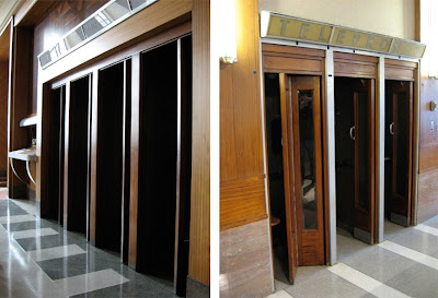
Telephone booths, east and west wings [3/30/8].
Of course, all phones have now been removed.


Amtrak Waiting Room, north end [3/30/8].
This room, open only during the three times a year that Amtrak delivers a train from Chicago, actually used to be the "Men's Lounge", featuring intricate wall designs,
bathroom/showers, and phone booths (seen in the phone photo, above left). There was a complimentary "Women's Lounge" in the west wing of the building (near the restaurant areas), but ran out of juice in my camera - was the same, if not more, intricately designed (i.e. Pierre Bourdelle's carved/painted linoleum panels).


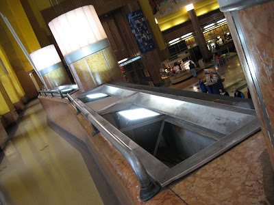
Drinking fountain, west wing [3/30/8].
After two decent-sized tours throughout the building, we were parched.


Again, a great tour through spaces rarely seen. In retrospect, I'm not as shocked at the amount of expense and detail the creators put into the building, as much as why anyone would want to travel by car... or even desire to tear this place down (like in the 70s)! Amazing...


Doors, CMC/UT [3/30/8].
Exiting our tour, and the building.


Part III of this article coming soon.


• Visit the Cincinnati Museum Center at the Union Terminal for more information on these tours and other 75th Anniversary events - they're worth every minute and dollar. Also, visit the Center's corresponding Anniversary website here.

Wednesday, April 2, 2008

Topping Out [Part I]

On Sunday (March 30th), Elizabeth and I explored the Cincinnati Union Terminal in completely new ways through a "High Steel Tour" and "Rotunda Tour"... respectively, an architectural/constructive and design-centered history, formed in celebration of the 75th Anniversary ['Diamond Jubilee'] of the building.
I never questioned it, but the guides' presumption was correct: the tours do lend to a new, lasting appreciation of the building and our local forefathers.


Right wing facade of the Cincinnati Union Terminal [3/30/8].
The hole in the wall was the location of the 1958 time capsule (opened on 3/29/8).


Although we missed the opening of the time capsule by 24 hours, we got there early for our tours, which allowed us to talk with a couple of the docents beforehand - a group dedicated to propagating the history of the structure and its relation to the city. Note: Anytime you can engage docents in smalltalk, the better - there's a strong possibility that they'll give you inside information (verbally and/or physically). Good preparation for the gig we payed for...

High Steel Tour

This tour (which was a steal at $15/ea) focused mainly on the structural components of the building, and allowed us to travel behind the walls, up above the interior dome. Without visual evidence [recording of any kind was not allowed], all I can say is that the hour-long trek was extremely interesting, and not for those with acrophobia. Not only did we receive a 10-minute Powerpoint presentation on the history of the construction process (up a few floors, within the walls, next to the steel supports), our guide initiated a second, oral presentation of the smaller facets of the construction first-hand (while standing on a catwalk at the peak of the dome, directly on top of the steel beams).


Cincinnati Union Terminal construction [11/5/31].
Source: Cincinnati Museum Center.


Although the visual presentation was very interesting, the more intimate discussion at the peak of the rotunda were included, such as: workers used slipsticks for measurements (or slide-rules - obviously, everything was analog in those days), rivets were hand-hammered (there was an example of one rivet that was struck twice, and thus, disfigured), old graffiti was pointed out on the beams (which is now very illegal, due to its national 'historic' registry), and an explanation of how
the plaster for the walls/ceiling was applied (which we were practically standing on... it's about 1 1/2" thick, by the way).


CUT construction [late-1931].
Source: Wikipedia: Cincinnati Museum Center at Union Terminal.


Aside from experiencing the skeleton firsthand, one of the coolest parts was simply having to climb 'ladders' and use catwalks with wobbly railings when up in the dome area. Also, when directly on top, you could lean over and look through some of the vent holes of the rotunda to see the floor 106' below (one of which had a dead bird in it). Our tour guide was also very good at adding humor to the experience, saying that if anyone falls over, lawyers would end the tours indefinitely (which actually was true). Thus, we all kept distractions to a minimum - phones silent, clothes tight, and cameras off.


CUT/CMC rotunda interior [1/4/8, undated].
Left photo: Red arrow shows the general path of our tour within the walls of the building. Right photo: Catwalk was directly above the center of the arch, where we stopped for an informal discussion of the structure (red arrow shows one of the vents we looked through to see the floor - also, location of the dead bird).
Sources: CincyImages & Richard Cummins
(via Lonely Planet Images).


Finally, I considered showing the construction process of the building as an addition to this post, using internet sources and my own extensive library, but it would be far better for everyone to experience the structure firsthand - these tours not only financially support a treasured city asset, but offer an invaluable, unique perspective to its citizens. Trust me, it's worth it.
As motivation, the Museum Center is currently hosting a companion website on the history & memories of the Terminal. View it here.

Check back soon for Part II of this article.


• The post title refers to an antiquated tradition by high-steel workers (and builders with other materials) of placing an evergreen tree on the last piece of steel (usually at the peak of the structure) [explanation here].
Aside from what the linked article offers, my past Architectural History professor stated that the act was in deference to traditional construction processes (usually with wood), humans' intelligence and ingenuity through the 'conquering of nature', and at the same time, reverence of the natural materials that supplied the development of the structure.